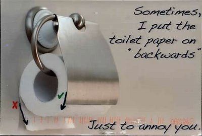
PostSecret: an ongoing community art project where people mail in their secrets anonymously on one side of a homemade postcard.

PostSecret: an ongoing community art project where people mail in their secrets anonymously on one side of a homemade postcard.

40% Off CR Today: best be quick, though, the offer ends 10.30am GMT tomorrow morning.

The latest addition to the gorgeous Chalkwork icon family:
Chalkworks Information Management
Eight ways to drive a graphic designer mad is genuinely funny, in a slightly depressingly true sort of way.
(via swissmiss)


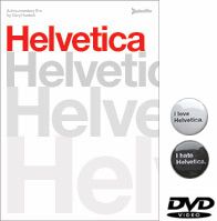
The DVD includes the full 80-minute feature film, plus over 90 minutes of additional interviews with Massimo Vignelli, Matthew Carter, Erik Spiekermann, Hermann Zapf, and more. (The director Gary Hustwit says, “we basically edited 41 short interview segments, each around two to five minutes long. If you’ve seen the film, you’ll have an idea of the format of these.”)
NTSC Region 0, 16×9 anamorphic widescreen presentation, full-color booklet, English and German language subtitles. Release date: November 6. Pre-order now, you’ll save $5 and receive early shipping (a week before street date) and two love/hate Helvetica film buttons.
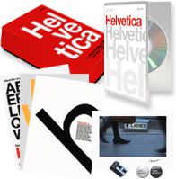
There’s also a limited edition 1000-run version that includes three letterpressed mini-posters, a color C-print of a still from the film (one of ten different stills) signed by Gary, two love/hate Helvetica buttons, and a letter of actual Helvetica metal type.
I’ve ordered my copy already!
DVD extra #1: Hermann Zapf on his work, Univers, Helvetica, and coffee (streaming Quicktime movie)
DVD extra #2: Helvetica DVD extra #2: Wim Crouwel on his “Proposal for a New Alphabet” (streaming Quicktime movie)
There are 38 more interviews like these on the DVD.
I’m not really a fan of CAPTCHAs as all too often they’re inaccessible to disabled users, but I must admit to being impressed by the ingenuity of reCAPTCHA. They provide plugins for most popular web software for you to use as you would normally, but the twist is that each correctly supplied word helps to digitise books by using human input to convert the scanned type; a task that people are good at but computers find difficult. Clever!
We Made This: 1976 Olympic logo design:
We Made This
�« Pictobrowser | Main
1976 Olympic logo design
We nipped across to Radio Days (careful, the site’s got tunes) in Waterloo earlier today, which is one of our favourite shops in London, with a fantastic collection of vintage clothing, collectables and memorabilia, from the 1920s to the 1970s. (Actually, the whole of Lower Marsh Street is pretty groovy.)
Anyway, we picked up an old copy of Design Magazine from January 1975, and its feature article was all about the design of the Montreal 1976 Olympic Games logo. It makes for pretty interesting reading 32 years later, especially with all the hoo-ha about the London 2012 logo.
Apparently the logo represents a podium, a running track, and a letter M for Montreal. Podium: yep, we’re with you. Running track: um, a bit. M for Montreal: not so much, what with an M having two humps, not three.*
Since we’re feeling generous, you can read all about the logo’s development, as we’ve scanned the whole article for you. Check it out r
In 1947 Life Magazine asked some famous comic strip artists to to draw their famous characters while wearing a blindfold. The results are fascinating! (Via BoingBoing.)
© 2026 stefpause.com
Theme by Anders Norén — Up ↑