
Impeccable work, as ever – a distinctive new slab from H&FJ: Vitesse
Impeccable work, as ever – a distinctive new slab from H&FJ: Vitesse

Via the ever-brilliant FontShop mailout comes the lovely sharp-serifed Beaufort Pro from Nick Shinn. This looks to be an ideal choice if you’re after an air of class, a Copperplate Gothic-like feel only without the cliché. Get the PDF specimen here. (716KB PDF)

Linotype announces a new serif companion to one of the world’s most popular sans typefaces.

Gentium is an freely available typeface, released under the SIL Open Font License, with multiple weights and an extensive character set. The family was recent expanded to include Gentium Basic and Gentium Book Basic, which are based on the original Gentium design but with additional weights. The ‘Book’ family is slightly heavier for printing at smaller sizes. Both families come with a complete regular, bold, italic and bold italic sets.
Yves Peters’ superb column over at Typographer.org, Bald Condensed, is back!
FF Meta Serif, the eagerly anticipated serif complement to FF Meta, is finally ready. Check out the sample specimens over at FontFont, it’s a beautiful collection.
(Thanks to Yves for the tip-off.)
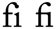
“I Love Typography” covers the Decline and Fall of the Ligature.
Subtraction: A Man of Illegible Letters:
Oof. I had a look at my handwriting the other day, when I scribbled a note to accompany a package I was sending off. My chicken scratch looked horrible, nearly illegible, even. After years and years of keyboard use, my penmanship has clearly deteriorated.
It�s not that I write by hand so rarely that it was a shock for me to see how poorly formed my letters are. But I was writing at a moderately greater length than usual, and it made an impression on me how malformed many of the letters turned out. I had to go back in and add missing strokes and stems to many of the otherwise inscrutable letters just to make sure I didn�t come across as some kind of maniac.
Above: Letter by letter. A sample of my deteriorating penmanship. Points if you know where this passage of text came from.
I was also struck by
© 2026 stefpause.com
Theme by Anders Norén — Up ↑


