Category: typography (Page 2 of 3)

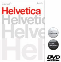
Helvetica: the DVD

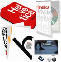
Helvetica: the DVDHelvetica: the deluxe DVD boxed set

Helvetica: the DVD

The DVD includes the full 80-minute feature film, plus over 90 minutes of additional interviews with Massimo Vignelli, Matthew Carter, Erik Spiekermann, Hermann Zapf, and more. (The director Gary Hustwit says, “we basically edited 41 short interview segments, each around two to five minutes long. If you’ve seen the film, you’ll have an idea of the format of these.”)

NTSC Region 0, 16×9 anamorphic widescreen presentation, full-color booklet, English and German language subtitles. Release date: November 6. Pre-order now, you’ll save $5 and receive early shipping (a week before street date) and two love/hate Helvetica film buttons.

There’s also a limited edition 1000-run version that includes three letterpressed mini-posters, a color C-print of a still from the film (one of ten different stills) signed by Gary, two love/hate Helvetica buttons, and a letter of actual Helvetica metal type.

I’ve ordered my copy already!

UPDATE:

DVD extra #1: Hermann Zapf on his work, Univers, Helvetica, and coffee (streaming Quicktime movie)

DVD extra #2: Helvetica DVD extra #2: Wim Crouwel on his “Proposal for a New Alphabet” (streaming Quicktime movie)

There are 38 more interviews like these on the DVD.

(via Typophile)

The ugliest British banknote ever

The new British 20 pound note

BBC News has a good overview of the new £20 note. It has to be the ugliest British banknote I’ve ever seen. The front isn’t bad but the rear, oh my, where to start with this monstrosity?

What the hell is going on with that illustration in the centre? The guilloché behind it makes it far, far too busy, it makes my eyes hurt just to try and figure out what’s going on.

The profile portrait of Adam Smith is remarkably ugly; look at the previous 20’s portrait of Edward Elgar and scratch your head as to why they couldn’t come up with something more tasteful.

What’s going on with the stroke around the “£20” in the top right corner, and why has someone just peppered a load of EURion constellations around it with no effort to make them fit in?

Who was responsible for the punctuation of the horrible condensed sans text that reads “The division of labour…”, and since when did it become normal to end a sentence with a colon, only to follow it up with bracketed, uncapitalised and unpunctuated text? (Is that colon pointing at the design, or what?)

And finally, is that “Twenty Pounds” and “Bank of England” set in Bodoni? Now you’re just taking the piss…

« Older posts Newer posts »

© 2025 stefpause.com

Theme by Anders NorénUp ↑