This one’s bugged the hell out of me for ages, but until I started using GNU Screen I never got round to fixing it. Desp has the skinny on fixing the backspace and forward-delete keys in OS X 10.4’s Terminal.app.
Author: Stef (Page 54 of 61)
Well it’s about time! Engadget has coverage of the Apple & EMI joint event, live from London. In summary, EMI are selling their entire catalogue as a new iTunes Music Store “premium” option: $1.29/€1.29/£0.99 per song gets you a DRM-free, 256kbps AAC track. That’s 30 cents/20 pence extra for no DRM, hence better interoperability, and better audio quality. Apple will still sell “standard” EMI tracks with DRM and 128-bit AAC encoding for $0.99/€0.99/£0.79.
“Premium” albums will cost the same price as “standard” albums, which is great news; along with Apple’s new “Complete My Album” feature this will hopefully redress the “death of the album” that’s been happening since single-track purchase came into existence.
Update: Turns out the reason Mail.app was downloading everything was due to to an malfunctioning plugin (JunkMatcher). Uninstalling this fixed it all, thankfully! Continue reading
BBC News: 20 Hidden Tourist Gems in Great Britain. (I say GB rather than the UK as the Isle of Man is not part of the UK – it’s a British Isle.) And yes, you really can see England, Northern Ireland, Scotland and Wales from the top of Snaefell on a clear day.
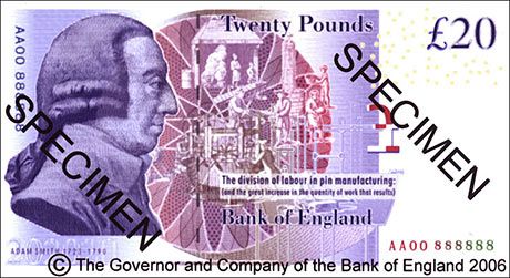
BBC News has a good overview of the new £20 note. It has to be the ugliest British banknote I’ve ever seen. The front isn’t bad but the rear, oh my, where to start with this monstrosity?
What the hell is going on with that illustration in the centre? The guilloché behind it makes it far, far too busy, it makes my eyes hurt just to try and figure out what’s going on.
The profile portrait of Adam Smith is remarkably ugly; look at the previous 20’s portrait of Edward Elgar and scratch your head as to why they couldn’t come up with something more tasteful.
What’s going on with the stroke around the “£20” in the top right corner, and why has someone just peppered a load of EURion constellations around it with no effort to make them fit in?
Who was responsible for the punctuation of the horrible condensed sans text that reads “The division of labour…”, and since when did it become normal to end a sentence with a colon, only to follow it up with bracketed, uncapitalised and unpunctuated text? (Is that colon pointing at the design, or what?)
And finally, is that “Twenty Pounds” and “Bank of England” set in Bodoni? Now you’re just taking the piss…
New Garmin Forerunner 305 device software (firmware), for all you GPS-tracking fitness junkies out there. Via the MotionBased blog Full list of changes after the jump:
Record sleeve designs of the week from Creative Review.
Cartoonist Daryl Cagle points out that the LA Times resembles a ransom note, with a staggering 22 different fonts above the fold on the front page! via Veer.
Josiah Cole has an excellent rant over what NOT to do when building a website. He’s bang-on for the most part, though I’ll contest no. 6 in that, rather than print designers specifically, he should really be having a go at people who blatantly don’t know what they’re doing but think that they do. While everyone has to start somewhere, and “winging it” a little is part of life, were the individuals he describes to show some humility and admit to not knowing it all, they’d go a long way to convincing people that they’re not assholes.
I’ll add a couple (of tongue-in-cheek digs) to his list:
- Don’t require users to log in to post comments. If they’re first time visitors and have something to say, any barriers to them saying it will mean they stay silent. And if you do insist on logins, implementing OpenID is as good a compromise as any.
- Following up on the “you’re vs. your” common misspellings point, don’t mix up “here and hear”. (See the copy in point 6.)

