Author: Stef (Page 49 of 61)

KLF: Burn a Million Quid (video) and The Manual (e-book)


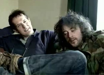
BB pal Michael W. Dean recently reminded us of the work of K Foundation, the UK anarcho-prankster duo who set about to become ginormous pop stars in the 1980s, and did just that as The KLF.

In 1988, members Bill Drummond and Jimmy Cauty self-published a book (“The Manual“) with step-by-step instructions on how anyone might do exactly the same: PDF Link to a copy of “The Manual.”

Here’s a snip from the Wikipedia entry for KLF:

From the outset, they adopted the philosophy espoused by esoteric novels The Illuminatus! Trilogy, gaining notoriety for various anarchic situationist manifestations, including the defacement of billboard adverts, the posting of prominent cryptic advertisements in NME magazine and the mainstream press, and highly distinctive and unusual performances on Top of the Pops. Their most notorious performance was at the February 1992 BRIT Awards, where they fired machine gun blanks into the audience and dumped a dead sheep at the aftershow party. This performance announced The KLF’s departure from the music business, and in May 1992 the duo deleted their entire back catalogue.


With profits earned from KLF, Drummond and Cauty created the K Foundation, with a mission to subvert the contemporary art world.

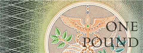
Among the hijinks that ensued: an alternative art award for the worst artist of the year, and burning a million British pounds in cash (about $1.8 million US at the time), which represented nearly all of their pop star earnings.

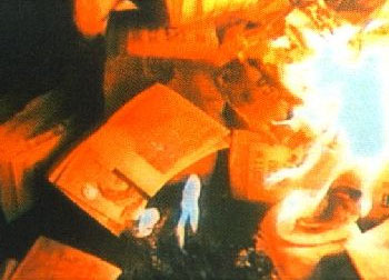
The odd process leading up to that torching, and the burn itself — which took place on a Scottish island in the summer of 1994 — are documented in the film K Foundation Burn a Million Quid.

You can watch that on the youtubes, in five parts, starting here: Video Link. Update: Thanks to the many BB readers who pointed out that the whole film is available in a single, less crappy quality, downloadable file on Google Video: Link.


[From KLF: Burn a Million Quid (video) and The Manual (e-book)]

No Second Chance

When two planes from the “Zelazny” display team collided killing both pilots at a weekend airshow over Radom in Poland, photographer Kacper Pempel nailed the full horror of the crash in a sequence which takes us from the moment three three planes converge to the violence of the impact and the aftermath as debris and a few recognisable components seem to hang in the sky and then rain down like confetti around the crippled remains of one of the aircraft.

Crash 1

[From No Second Chance]

Subtraction: A Man of Illegible Letters

Subtraction: A Man of Illegible Letters:

Oof. I had a look at my handwriting the other day, when I scribbled a note to accompany a package I was sending off. My chicken scratch looked horrible, nearly illegible, even. After years and years of keyboard use, my penmanship has clearly deteriorated.
It�s not that I write by hand so rarely that it was a shock for me to see how poorly formed my letters are. But I was writing at a moderately greater length than usual, and it made an impression on me how malformed many of the letters turned out. I had to go back in and add missing strokes and stems to many of the otherwise inscrutable letters just to make sure I didn�t come across as some kind of maniac.

Above: Letter by letter. A sample of my deteriorating penmanship. Points if you know where this passage of text came from.
I was also struck by

We Made This

We Made This:
We Made This
Beautiful Sci-Fi covers shock

We were strolling through Foyles the other day and stumbled across this stunning new Future Classics series from Gollancz, the science-fiction and fantasty arm of Orion Books.

The front covers are really startling in their boldness. No title. No author name. No publisher’s logo. Just fantastically striking and truly graphic images, combined with a great use of material and print process.

Of the three above, from left to right, Fairyland by Paul J McAuley uses a holographic foil and irridescent cover stock; The Separation by Christopher Priest uses an uncoated stock and a deboss; and Hyperion by Dan Simmons uses a spot varnish over black.

The spines and back covers have been given a series style with what looks like American Typewriter as the series typeface.

When you see what the previous cover was for Fairyland (below), you can see how radical a shift they’ve made. From a quick browse of a few online sci-fi forums it looks like existi

« Older posts Newer posts »

© 2025 stefpause.com

Theme by Anders NorénUp ↑