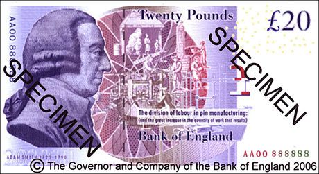
BBC News has a good overview of the new £20 note. It has to be the ugliest British banknote I’ve ever seen. The front isn’t bad but the rear, oh my, where to start with this monstrosity?
What the hell is going on with that illustration in the centre? The guilloché behind it makes it far, far too busy, it makes my eyes hurt just to try and figure out what’s going on.
The profile portrait of Adam Smith is remarkably ugly; look at the previous 20’s portrait of Edward Elgar and scratch your head as to why they couldn’t come up with something more tasteful.
What’s going on with the stroke around the “£20” in the top right corner, and why has someone just peppered a load of EURion constellations around it with no effort to make them fit in?
Who was responsible for the punctuation of the horrible condensed sans text that reads “The division of labour…”, and since when did it become normal to end a sentence with a colon, only to follow it up with bracketed, uncapitalised and unpunctuated text? (Is that colon pointing at the design, or what?)
And finally, is that “Twenty Pounds” and “Bank of England” set in Bodoni? Now you’re just taking the piss…
Leave a Reply